The 6 Best Tools for Analyzing and Visualizing Data Without Being a Data Scientist
In this article, we’ve selected six tools capable of transforming your raw data into actionable insights, without needing to hire a full-time data analyst, and with a negotiated deal on Freelance Stack for each of them.
Why does your data deserve better than an Excel spreadsheet?
There was a time when analyzing data meant either mastering SQL or spending hours poring over spreadsheets that became unreadable once they exceeded 500 rows. That time isn’t entirely gone, but it belongs to an era when non-technical users simply didn’t have access to their own metrics.
Today, the situation has changed dramatically. Business intelligence and analytics tools have undergone a radical transformation in recent years: drag-and-drop interfaces, automatic connections to data sources, and dashboards generated in just a few clicks. The democratization of data is no longer just a marketing slogan; it’s an operational reality for thousands of entrepreneurs and small teams.
And yet, many still miss the mark. Not because of a lack of data-quite the opposite. A SaaS startup constantly generates streams of user behavior, conversions, and product events. A growing freelancer has revenue figures, customer retention rates, and performance metrics by channel. An SME accumulates sales, marketing, and financial data. The problem isn’t the quantity-it’s knowing what to do with it, using which tools, without having to hire a full-time data analyst.
It is precisely to meet this need that we have selected six tools capable of transforming your raw data into actionable insights, accessible to everyone. Each one was chosen because it has an active deal on Freelance Stack because it addresses a specific use case: analyzing user behavior, managing your finances, understanding your traffic sources, or simply making your data understandable for your team or clients.
Here are the six you should know.
#1 - Mixpanel: The go-to product analytics tool for teams.
Mixpanel has established itself as one of the most powerful analytics tools on the market for product and growth teams. Its strength lies in a simple yet highly effective principle: instead of measuring page views like Google Analytics, it measures events. Every action a user takes in your app or on your website (clicking a button, filling out a form, triggering a feature) becomes analyzable data.
What Mixpanel actually does:
The tool allows you to build conversion funnels to pinpoint exactly where users drop off along their journey. It offers retention analytics to measure user loyalty over time, and flow charts to map the actual paths your audience takes. Cohort reports let you compare groups of users based on their acquisition date or initial behavior.
What sets it apart from general-purpose tools is its granularity. You can segment any analysis by user attribute, subscription plan, acquisition source, or device. In just a few minutes-and without writing a single line of code-you can generate visualizations that are ready to share.
Pricing:
Free Plan: up to 20 million events per month, access to core features with 90 days of data retention.
Growth Plan: starting at $28/month (unlimited historical data, advanced analytics, and custom reports).
Startups in the growth phase and product managers who want to understand how users adopt their features, identify friction points in the onboarding process, or measure the impact of a product update will find Mixpanel to be a tool tailored to their needs. Growth teams use it in particular to refine their retention loops and build more granular attribution analyses. If you have a web or mobile app with a defined user flow, Mixpanel is likely the best tool on the market for this category.
👍 What we like:
The depth of analytics available even on the free plan is rare. The interface is intuitive for anyone accustomed to working with data, even without advanced technical knowledge. The pre-built report templates make it much easier to get started.
👎 Drawbacks to be aware of:
The initial implementation requires some development work to properly tag events. If your tech stack isn't yet in place or if you're just getting started, this step can be a hurdle. There is also a real learning curve involved in leveraging all the advanced features.
Benefit from a on Mixpanel.
1 year free
Find our best discount right now with Mixpanel and save on your software subscriptions. We offer over 850 promo codes and discounts on the best software and SaaS on the market.
#2 - Amplitude: Behavioral analytics designed for teams building digital products.
Benefit from our free deal on Amplitude.
20% off on annual plan
Find over 300 free deals as well as over 850 Premium deals right now with Amplitude and save on your software subscriptions. Whether you're an entrepreneur, a startup or a solo freelancer, save hundreds of euros thanks to our discounts and promo codes.
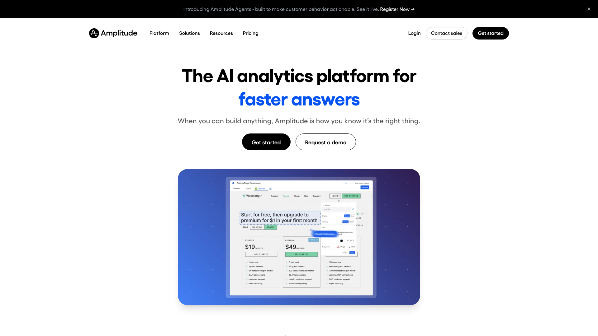
Amplitude occupies a unique position in the world of product analytics. Often compared to Mixpanel, it stands out for its approach, which is more focused on data exploration and cross-team collaboration. While some tools offer static dashboards, Amplitude provides a shared workspace where everyone can build their own analyses.
What Amplitude actually does:
At the core of the product lies Amplitude Analytics, which enables users to build event-based analyses similar to those in Mixpanel, but with a particularly well-designed interface for complex queries. Amplitude has also expanded intoexperimentation (with built-in A/B testing) and a Customer Data Platform ( CDP ) to centralize user data from multiple sources.
The Behavioral Cohorts feature deserves special mention: it allows you to automatically create user segments based on specific behaviors and use them as target audiences for marketing campaigns in other tools. Integration with platforms like Brevo or ActiveCampaign makes this feature particularly powerful for marketing teams.
Pricing:
Starter Plan: Free (up to 50,000 monthly active users, core features included).
Growth Plan: Pricing based on the number of users (advanced experimentation and segmentation features).
Amplitude is particularly popular among product teams at scale-ups that need to collaborate on data. If multiple people in your organization (product, growth, data, marketing) need to access and share analytics, Amplitude’s collaborative environment is a real asset. Teams that conduct regular A/B testing will also appreciate the native integration of experimentation.
👍 What we like:
The interface is among the most polished on the market for this type of tool. The dashboards are clear, reports are quick to generate, and the documentation is top-notch. The free plan is generous for startup projects.
👎 Drawbacks to be aware of:
While its rich feature set is a plus, it can be a drawback if you're looking for something simple. For a freelancer or a very small business that doesn't yet have a product manager, Amplitude may seem overkill. Switching to a paid plan can also represent a significant budgetary increase, depending on your volume.
Benefit from a on Amplitude.
12 months free on “Growth” plan
Find our best discount right now with Amplitude and save on your software subscriptions. We offer over 850 promo codes and discounts on the best software and SaaS on the market.
#3 - Hotjar: The must-have tool must-have understanding what your visitors are really doing on your site.
Benefit from our free deal on Hotjar.
20% off on annual plan
Find over 300 free deals as well as over 850 Premium deals right now with Hotjar and save on your software subscriptions. Whether you're an entrepreneur, a startup or a solo freelancer, save hundreds of euros thanks to our discounts and promo codes.
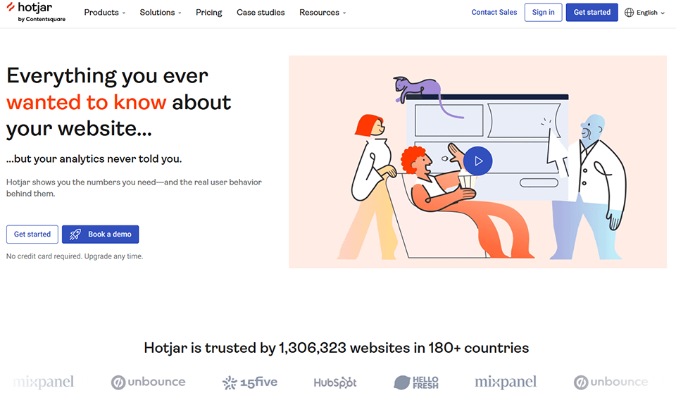
Hotjar falls into a category distinct from the previous two. While Mixpanel and Amplitude focus on events and user cohorts, Hotjar offers a qualitative and visual understanding of your visitors’ behavior. With heatmaps, session recordings, and built-in surveys, it provides a window into your users’ actual experience.
What Hotjar actually does:
Heatmaps visually show where users click, how far they scroll, and where their eyes linger on a page. Session recordings let you replay individual visits to understand unusual behavior or identify interface bugs. Built-in funnels help you identify the pages with the highest bounce rates.
In addition, there are direct feedback tools: surveys that can be triggered after a specific action, and feedback widgets that allow users to report an issue directly on your interface. This combination of quantitative and qualitative data is what makes Hotjar unique.
Pricing:
Basic Plan: Free (up to 35 daily sessions, including heatmaps and recordings).
Plus Plan: starting at $39/month (up to 100 sessions/day, access to advanced filters).
Business Plan: starting at $99/month (unlimited sessions, advanced segmentation).
Plan Scale: Upon request (for large volumes and business needs).
Who it's for:
Web developers, UX designers, and marketing teams looking to optimize their conversion pages will find Hotjar to be an ideal partner. It’s also a valuable tool for freelancers and consultants who work on optimizing landing pages or sales funnels for their clients. When paired with a tool like Webflow or Instapage, it forms a powerful combination for conversion rate optimization.
Product teams can also use it alongside Mixpanel or Amplitude to bring quantitative data to life: when your metrics show that users are dropping off at a specific stage, Hotjar recordings explain why.
👍 What we like:
Setup is extremely quick (just a code snippet or a WordPress plugin), and the tool starts collecting data right away. The free plan is sufficient to get started and validate basic insights. The interface is intuitive, even for someone who has never used this type of tool before.
👎 Drawbacks to be aware of:
Hotjar isn’t a traditional analytics tool: it doesn’t replace Google Analytics or Simple Analytics for tracking your traffic sources or SEO. It complements these tools rather than replacing them. Data privacy is also worth considering: make sure your setup complies with the GDPR, particularly regarding recordings (masking sensitive fields, consent banner).
Benefit from a on Hotjar.
Additional 40% off on annual plan
Find our best discount right now with Hotjar and save on your software subscriptions. We offer over 850 promo codes and discounts on the best software and SaaS on the market.
#4 - Simple Analytics: The ethical, GDPR-compliant alternative to Google Analytics.
In an environment where GDPR compliance has become a daily concern, Simple Analytics has built its value proposition around a radical principle: no cookies, no personal data collected, and no cluttered interface. The tool provides essential metrics on your web traffic while fully respecting visitors’ privacy.
What Simple Analytics actually does:
The dashboard displays key metrics: page views, unique visitors, most-viewed pages, traffic sources, countries, devices, and browsers. No cookie consent required, no banner, no complex setup. Custom events let you track specific conversions (button clicks, form submissions) without complex JavaScript code.
Simple Analytics also offers a unique feature: its data can be made public, allowing independent blogs and media to transparently share their statistics with their audience. This feature is particularly popular in tech and independent communities.
Pricing:
Starter Plan: starting at $9/month (up to 100,000 page views/month, 1 website included).
Business Plan: starting at $19/month (multiple sites, unlimited events, exports).
Enterprise Plan: starting at $59/month (high volume, priority support).
Who it's for:
Simple Analytics is ideal for freelancers, consultants, and content creators who want clean web analytics without the complexity of Google Analytics 4 or the hassle of cookie consent. It’s also perfect for startups that want to ensure GDPR compliance from the start without having to invest in a DPO or a complex legal setup.
If you use Webflow, Framer, or WordPress for your website, Simple Analytics can be set up in just a few minutes.
👍 What we like:
The tool’s lightweight design is a real advantage: it won’t slow down your website, there’s no complicated event setup required to get started, and no training is needed. You can get the hang of the dashboard in 30 seconds. And the ethical aspect is genuine: data isn’t resold, it’s hosted in Europe, and the company operates on a transparent SaaS model.
👎 Things to watch out for:
Simple Analytics isn't designed for teams that need in-depth analysis of user behavior, complex funnels, or advanced segmentation. It's intentionally a basic web analytics tool, and that's exactly what makes it valuable. If you need more, Mixpanel or Amplitude are better choices.
Benefit from a on Simple Analytics.
50% off on annual plan
Find our best discount right now with Simple Analytics and save on your software subscriptions. We offer over 850 promo codes and discounts on the best software and SaaS on the market.
#5 - RocketChart: The financial dashboard designed for SME executives and startup founders.
RocketChart tackles a specific yet critical challenge for every entrepreneur: cash flow management and financial data visualization. While Mixpanel caters to product teams and Hotjar to web teams, RocketChart is designed specifically for founders, CFOs, and managers who need to understand their cash flow, revenue, and projections without having to dig through Excel spreadsheets every week.
What RocketChart actually does:
The tool connects to your bank accounts and accounting software to automatically consolidate your financial data. It generates real-time cash flow dashboards, with forecasts based on your historical cash flows and manual projections. The visualizations include balance trends, a breakdown of expenses by category, projected cash flow statements, and alerts for critical thresholds.
The scenario feature allows you to simulate the impact of a decision (hiring, investment, pricing change) on your cash flow over 3, 6, or 12 months. It is this predictive capability that sets it apart from a standard bank statement.
Pricing:
Note: RocketChart's pricing changes regularly. We recommend checking the current terms directly on their Freelance Stack offer.
Who it's for:
RocketChart is designed for startup founders juggling MRR, burn rates, and runway projections, as well as for SMB executives who want a clear picture of their financial situation without having to wait for their accountant’s annual financial statement. It integrates seamlessly into an ecosystem that already includes tools like Pennylane or Qonto for accounting and banking management.
👍 What we like:
The tool’s specialization is its greatest strength. Rather than offering a general-purpose analytics solution, RocketChart has focused on a well-defined problem and solves it effectively. It’s quick to get started, and the visuals it generates can be shared directly with investors or a board of directors.
👎 Drawbacks to be aware of:
RocketChart is a financial tool, not a general-purpose BI tool. If you need to analyze product, marketing, or operational data, you’ll need additional solutions to complement it. Its usefulness also depends on the financial maturity of your organization: freelancers with a straightforward business may have less need for its advanced forecasting features.
Benefit from a on RocketChart.
30% off on annual plan
Find our best discount with RocketChart and save on your software subscriptions. We offer over 850 promo codes and discounts on the best software and SaaS on the market.
#6 - Baremetrics: The ultimate SaaS metrics dashboard for founders who want to track their recurring revenue.
Benefit from our free deal on Baremetrics.
Find over 300 free deals as well as over 850 Premium deals right now with Baremetrics and save on your software subscriptions. Whether you're an entrepreneur, a startup or a solo freelancer, save hundreds of euros thanks to our discounts and promo codes.
Baremetrics stands out from the rest in this selection. While most analytics tools aim to be versatile, Baremetrics has chosen to specialize exclusively in SaaS metrics and recurring revenue. If you operate a subscription-based model (SaaS, membership, paid newsletter), it’s one of the most powerful tools for understanding what’s really going on in your business.
What Baremetrics actually does:
Baremetrics connects directly to your payment processor (primarily Stripe, but also Braintree, the App Store, etc.) and automatically generates a comprehensive dashboard of SaaS metrics: MRR (Monthly Recurring Revenue), ARR, churn rate, LTV (Lifetime Value), ARPU (Average Revenue Per User), new subscriptions, upgrades, downgrades, reactivations...
These metrics are displayed over time, with the option to segment by plan, by coupon, or by acquisition cohort. The Recover feature is worth mentioning: it automatically sends emails to customers whose payments have failed in order to recover lost revenue.
Pricing:
Baremetrics plans are priced based on the amount of MRR managed. The exact details are available on their Freelance Stack page, but generally, you can expect to pay around $100 per month for entry-level plans.
Who it's for:
Baremetrics is primarily aimed at SaaS founders and creators of subscription-based digital products. If you process payments through Stripe and have dozens or hundreds of subscribers, you’ll save time right away: no more SQL queries or Excel spreadsheets needed to calculate your MRR. Investors and growth teams will also appreciate the clarity of the reports generated, which can be shared directly via a public link or exported.
For those starting out with a simpler payment setup, a combination of Stripe and Chargebee can serve as a first step before switching to Baremetrics.
👍 What we like:
Connecting to Stripe is almost instantaneous, and historical data is imported immediately. The dashboard is sleek and intuitive, and the visualizations are clear enough to be presented directly to investors or a board. Baremetrics has built up significant expertise in SaaS metrics, and this is evident in the relevance of the analyses it provides.
👎 Things to watch out for:
The tool focuses exclusively on recurring revenue: if you have a one-time, transactional, or highly mixed payment model, Baremetrics will be of limited value. The price may also seem high for a very early-stage startup. In that case, some basic features are available for free in Stripe itself, although the depth of analytics isn’t comparable.
Benefit from a on Baremetrics.
20% off on any plan
Find our best discount right now with Baremetrics and save on your software subscriptions. We offer over 850 promo codes and discounts on the best software and SaaS on the market.
Comparative overview: Which tool is best for which profile? 📋
Before presenting the comparison chart, here’s an important reminder: the best data visualization tool is the one your team will actually use. Functional sophistication is meaningless if the dashboard remains empty because it isn’t being used. Always start with the questions you need to answer, and choose the tool based on that-not the other way around.
Tool
Primary use case
Complexity of use
Target profile
Admission price
Mixpanel
Product Analytics & User Behavior
Average
Product managers, SaaS teams
Free (limited)
Amplitude
Collaborative Product Analytics & Experimentation
Moderate to high
Scale-ups, product/growth teams
Free (limited)
Hotjar
UX analytics & heatmaps
Low
Webmasters, UX specialists, consultants
Free (limited)
Simple Analytics
GDPR-compliant web analytics
Very low
Freelancers, startups, creators
9 $/month
RocketChart
Cash Flow & Financial Forecasts
Low to moderate
SME executives, founders
On request
Baremetrics
SaaS Metrics & Recurring Revenue
Low
SaaS founders, growth teams
~100 $/month
The prices listed are for reference only and may have changed. Please check the relevant deals pages for the current offers negotiated by Freelance Stack.
See all the software of this category: Donnés
Check out all the other software and discount we offer in this category. Explore other tools and choose the perfect solution to grow your business.
Frequently Asked Questions About Data Analysis Without Technical Skills 🙋
1️⃣ Do you absolutely have to know how to code to use these tools?
No, and that’s precisely why they exist. Tools like Hotjar, Simple Analytics, RocketChart, and Baremetrics can be set up without any technical expertise. Mixpanel and Amplitude, on the other hand, require a minimal amount of development work to set up event tracking, but the dashboards themselves can be used without coding.
2️⃣ Can I use several of these tools at the same time?
Yes, and it’s actually recommended for growing companies. A good basic setup: Simple Analytics for web traffic, Hotjar for analyzing user behavior on your pages, and Mixpanel or Amplitude if you have an app with active users. For SaaS companies, add Baremetrics to track your recurring revenue.
3️⃣ Are these tools GDPR-compliant?
It depends on the tool and its configuration. Simple Analytics was designed from the ground up to be GDPR-compliant without cookies. Hotjar, Mixpanel, and Amplitude collect behavioral data and require an appropriate privacy policy and, in some cases, a consent mechanism. If compliance is a priority, start with Simple Analytics and review each tool’s GDPR documentation before deploying. Solutions like Axeptio or Cookiebot can also help you manage consent in a compliant manner.
4️⃣ What is the difference between a web analytics tool and a product analytics tool?
Web analytics (Simple Analytics, Google Analytics) measures traffic on your pages: who visits, where they come from, how long they stay, and which pages they visit. Product analytics (Mixpanel, Amplitude) measures what your users do once they’re logged into your product: which features they use, where they drop off, and how they progress. If you have a showcase website or a blog, web analytics is usually sufficient. If you have an app or a SaaS tool, product analytics will provide you with much more actionable insights.
5️⃣ How do I choose between Mixpanel and Amplitude?
Both tools are excellent and very similar in terms of functionality. Amplitude tends to be slightly more intuitive for non-technical teams and offers a better collaborative environment. Mixpanel is often considered more flexible when it comes to complex queries. In practice, both offer a free version, so there’s nothing stopping you from testing both in your own environment before committing.
6️⃣ Can these tools replace hiring a data analyst?
They can delay-and sometimes completely eliminate-the need for a full-time data analyst in organizations with fewer than 50 employees. The goal is to empower teams to handle 80% of their daily analytical needs on their own. For truly complex analyses (predictive modeling, machine learning applied to business, multi-source data warehouses), you will eventually need specialized human expertise.
7️⃣ Where can I find discount these tools?
Freelance Stack exclusive promo codes for all the tools featured in this article. You can find all available offers directly on freelance-stack.io in the Data - Analytics & Management category.